6 Factors To Consider Before Developing A Responsive Website For Your Business!
Having a full-fledged professional website for your business is the prerequisite for establishing a successful business and building strong relationships with your customers.

Google promotes secured (SSL certification) Responsive websites at higher ranks in the search engine result pages (SERP).
Check here,
• Why You Should Use Responsive Web Design?
• Does Your Website Need SSL?
To improve relationships with your existing customer base and prospects it is highly recommended to maintain a mobile-friendly website. Where mobile users can easily access your web page or online store and buy your products or services.
Responsive web design service will help you to engage with your customers for a longer period and to give the best user experience. Providing a seamless experience to your users across all the devices must be your fundamental marketing goal. Do you have a retail business? Check out here, Why You Need an E-Commerce Website for Your Retail Business?
1. Check Font Sizes - Your Website Content must be Easy to Read :
Your responsive website is designed to get accommodated across all screen sizes. It quickly loads on every screen size, right from 1366x768 resolution desktops to 4.7 inches Mobile screens or even small.
Your content must be readable so that your customers or target audience could understand, what you are trying to say and sell.
In web designing, Typography is a significant aspect.
While designing responsive websites, you must pay attention to your choice of font designs, it must fit with other aspects of the site's layout As a change in screen sizes may disturb the website's look and feel.
Picking up a typeface for your responsive website is very crucial, make sure that your choice of fonts and font size goes well. It must render the best experience in every screen size- smaller or larger.
Be sure you don't select thin letterforms. Few typefaces having thin letterforms can work well in large or medium-sized screens, but it can lose clarity when they are viewed in small-sized screens.
Avoid choosing typefaces with thin letterforms as it would affect your website's readability and destroy the customer experience.
Customer's unable to read and understand your content may leave your website immediately, without exploring your services. It may tremendously harm your sales funnel, reduce conversions and sales.
But, if you have to select a typeface with thin letters then make sure that it is legible in its minimum size or think about substituting any other font to maintain the look and feel.
With a wider column of text, the line-height also increases, that is the vertical height of every line-of-text. It helps users to find the beginning of the next line.
Avoid using less than 16pt body type text in your responsive web design. Most of the browsers have 16pt body type as default and the best place to start for all screen sizes.
Know What Our Experts have in for You- Request a Quote!

Adjust adequate contrast in your site's layout, adjust the background colour, the text colour against the background and colour of the web links against the website content. Make sure you carry out your design and development, with precision.
It would help you increase the customer engagements on your website. Check here, how increased customer engagements can boost your sales.
How Customer Engagement Can Boost Up Growth Of Your Business?
2. Place Appropriate Icons :
Using appropriately designed Icons can improve your responsive web design in several ways.
Thoroughly designed, appropriate iconography helps to replace lengthy textual content, it is recommended for smaller screens, where it can load smoothly, look spacious and deliver a better look.
Your audience can easily determine the action to be performed without reading the lengthy text content and enter the sales funnel.
You can use Icons for your website using the SVG file format. The Scalable Vector Graphics are highly recommended for multi-device friendly websites. It can be resized as required.
Scalable Vector Graphics files can be animated using CSS. You can add some visually appealing effects to your web design without making it heavy because of the usage of extra scripts that can harm website performance.
You will need fall back support for web browsers that don't support SVG. Web browsers who support SVG file format can enjoy many benefits.
Web developers will design your responsive web page using Html, CSS style sheets, JavaScript, latest web technologies, flexible images, fluid grids, viewport width and other responsive web elements.
Check out, Website trends to watch and Why Professional Web Designing Company Is A Better Choice?
Know what our experts have in for You- Request a Quote!


The objective behind developing a business website is providing your customers with the best shopping experience. Your customers, while interacting with you, must feel at ease. Good customer experience creates profitable opportunities for business growth in the long run.
Today, most of the world population use mobile devices or smartphones for online shopping. As per the latest researches, around 91% of the internet users visit online shopping stores, 84% of the internet users conduct online searches to buy a product or service, and 77% of the internet users do online shopping using their smartphones.
So, it's crucial to provide your customers with a mobile-friendly environment. Smartphones are the most comfortable medium to get connected with your customer base. Your customers can reach you from anywhere and anytime. 56% of the customers use smartphones to get information about the business.
Currently, Responsive web designs are a trend in the industry. The reason behind this is the excessive use of mobile devices.
Responsive websites are mobile-friendly websites that get loaded on all of the screen-sizes. Responsive web design gives a seamless experience across all types of devices like Smartphones, tablets, desktops, laptops or any other.
The Responsive website elements and content aligns itself according to the screen size of the devices automatically. Developing a mobile-friendly website for your business is no longer an option, it is essential for your business growth.
Your website can be your most productive asset. Check here, How to Make Your Website Work for Your Business?
The increase in mobile traffic and Search engine's mobile-friendliness ranking factor signifies that a business must have a mobile-friendly responsive website to stay competitive in the market.
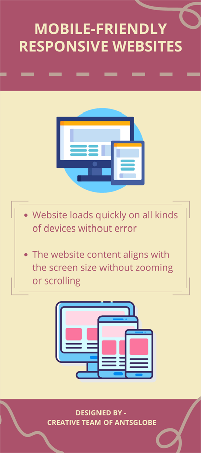
Mobile-friendly Responsive Websites :
• Website loads quickly on all kinds of devices without error.
• The website content aligns with the screen size without zooming or scrolling.
You can check your Business website's mobile-friendliness using Google's free mobile-friendliness tool to determine how to improve your websites.
• Website loads quickly on all kinds of devices without error.
• The website content aligns with the screen size without zooming or scrolling.
You can check your Business website's mobile-friendliness using Google's free mobile-friendliness tool to determine how to improve your websites.

Check here,
• Why You Should Use Responsive Web Design?
• Does Your Website Need SSL?
To improve relationships with your existing customer base and prospects it is highly recommended to maintain a mobile-friendly website. Where mobile users can easily access your web page or online store and buy your products or services.
Responsive web design service will help you to engage with your customers for a longer period and to give the best user experience. Providing a seamless experience to your users across all the devices must be your fundamental marketing goal. Do you have a retail business? Check out here, Why You Need an E-Commerce Website for Your Retail Business?
1. Check Font Sizes - Your Website Content must be Easy to Read :
Your responsive website is designed to get accommodated across all screen sizes. It quickly loads on every screen size, right from 1366x768 resolution desktops to 4.7 inches Mobile screens or even small.
Your content must be readable so that your customers or target audience could understand, what you are trying to say and sell.
In web designing, Typography is a significant aspect.
While designing responsive websites, you must pay attention to your choice of font designs, it must fit with other aspects of the site's layout As a change in screen sizes may disturb the website's look and feel.
Picking up a typeface for your responsive website is very crucial, make sure that your choice of fonts and font size goes well. It must render the best experience in every screen size- smaller or larger.
Be sure you don't select thin letterforms. Few typefaces having thin letterforms can work well in large or medium-sized screens, but it can lose clarity when they are viewed in small-sized screens.
Avoid choosing typefaces with thin letterforms as it would affect your website's readability and destroy the customer experience.
Customer's unable to read and understand your content may leave your website immediately, without exploring your services. It may tremendously harm your sales funnel, reduce conversions and sales.
But, if you have to select a typeface with thin letters then make sure that it is legible in its minimum size or think about substituting any other font to maintain the look and feel.
With a wider column of text, the line-height also increases, that is the vertical height of every line-of-text. It helps users to find the beginning of the next line.
Avoid using less than 16pt body type text in your responsive web design. Most of the browsers have 16pt body type as default and the best place to start for all screen sizes.
Know What Our Experts have in for You- Request a Quote!

Create readable content. Create headings, 1.6 times larger than the text.
Adjust adequate contrast in your site's layout, adjust the background colour, the text colour against the background and colour of the web links against the website content. Make sure you carry out your design and development, with precision.
It would help you increase the customer engagements on your website. Check here, how increased customer engagements can boost your sales.
How Customer Engagement Can Boost Up Growth Of Your Business?
2. Place Appropriate Icons :
Using appropriately designed Icons can improve your responsive web design in several ways.
Thoroughly designed, appropriate iconography helps to replace lengthy textual content, it is recommended for smaller screens, where it can load smoothly, look spacious and deliver a better look.
Your audience can easily determine the action to be performed without reading the lengthy text content and enter the sales funnel.
You can use Icons for your website using the SVG file format. The Scalable Vector Graphics are highly recommended for multi-device friendly websites. It can be resized as required.
Scalable Vector Graphics files can be animated using CSS. You can add some visually appealing effects to your web design without making it heavy because of the usage of extra scripts that can harm website performance.
You will need fall back support for web browsers that don't support SVG. Web browsers who support SVG file format can enjoy many benefits.
Web developers will design your responsive web page using Html, CSS style sheets, JavaScript, latest web technologies, flexible images, fluid grids, viewport width and other responsive web elements.
Check out, Website trends to watch and Why Professional Web Designing Company Is A Better Choice?
Know what our experts have in for You- Request a Quote!
3. Remember to Add Call-to-Action buttons :
When you are developing a responsive web design for your business, it is essential to add Call-to-Action buttons or links on your website that must be prominently displayed regardless of the device's screen size or web browser.
Call to action (CTA) buttons are a crucial element of any business website. You need to specify the course of actions to be performed to your visitors.
You can ask your website visitors to Sign up/Subscribe for a Newsletter, Email, E-book or Discount Coupon, fill up the contact form, or Check your Blog posts/Articles.
It is important to render a call to action link so that, your visitors have a clear direction for performing certain tasks that you require and enter your sales funnel.
Place the Call-To-Action buttons at points where they are visible. Design the buttons having at least 44x44 pixels size, so your customers can readily tap on it.
It will help you generate leads, increase conversions and sales. That is, it will convert the website visitors into your customers.
Responsive website with SEO compliance and digital marketing services would elevate your growth rates, increase sales and conversion rates. The mobile users can easily go through your product or services displayed on your web page and choose to buy from you. Effective digital marketing campaigns would make your business successful. Check here, 8 Tips for making your digital marketing strategy successful! and How digital marketing can boost up your business?
Know what our experts have in for You- Request a Quote!

4. Optimize Your Visual Content :
Visuals like infographics, images, illustrations, videos on your website play a significant role in web designing and engaging the customer base.
You must optimize the images (visual content), these must be responsive. That is, your visuals must be lighter in weight so that it quickly loads on the mobile browsers also and prevent the visitors from leaving your website.
Experts recommend Flat design, as it allows to deliver clear and lightweight graphics to the customers. A huge amount of information about the brand can be delivered to the customers through visuals.
Your audience can easily understand the information portrayed on images. Incorporate lightweight flexible images, fluid grids and attractive visual content for better results, it will improve the user experience and make your responsive website more intuitive for your mobile users.
Know What Our Experts have in for You- Request A Quote!

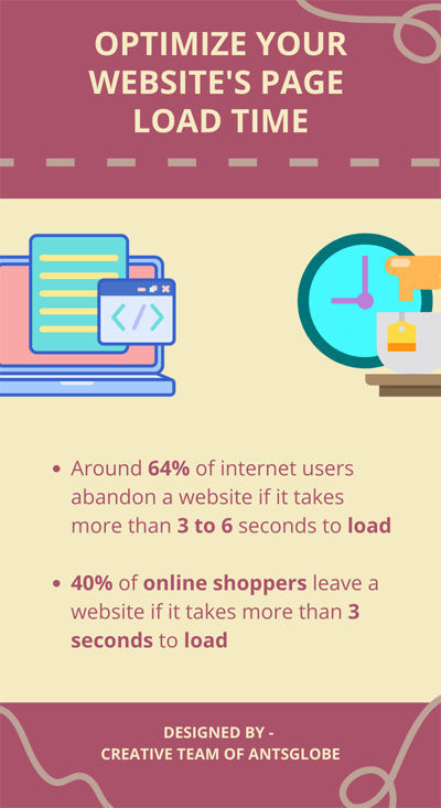
5. Optimize Your Website's Page Load Time :
This is the best way to help your customers in accomplishing their tasks quickly. It will improve the customer experience, make your customers happier and increase sales.
Around 64% of internet users abandon a website if it takes more than 3 to 6 seconds to load. Visitors get disappointed due to slow loading websites and more likely to bounce, which implies that your visitors, leave your website and never return due to bad experience.
40% of online shoppers leave a website if it takes more than 3 seconds to load.
Just a one-second delay can harm your customer relationships, reduce the level of customer satisfaction by 16%. It can drastically affect your brand repute, sales and leads generation process.
Know What Our Experts have in for You- Request A Quote!

6. Provide Easy Navigation :
Designing easy Navigation path for your visitors or customers is one of the most challenging aspects in developing a responsive website.
The navigation options working perfectly on larger screens can break down entirely on other devices with different screen sizes.
You must be concerned about creating clear and user-friendly navigation.
You must be consistent in designing your navigation, be consistent with the labels to be used on buttons and web links along with the visual characteristics of all the elements like font, size, color, and others.
Your content must be displayed appropriately on all the devices with varying screen sizes.
Easy navigation will assist your customers or potential customers to explore your website easily.
This would help you to enhance audience engagements and conversion rates.
Know What Our Experts have in for You- Request A Quote!

Wrapping Up!
Make sure you test your responsive website, its functional aspects properly, both downstream and upstream from the time of its creation. Add interesting features like geo-tracking, easy to swipe, scroll direct calls and others to improve the shopping experience.
The most important element to make your responsive business website successful is Search engine optimization (SEO).
So, you must be careful with your SEO practices for your business growth. Check here, How SEO Is The Key To Successful Business?
Make sure you are employing appropriate search engine optimization methods to increase your website's visibility and credibility. Your responsive website will get validated by the search engines.
As mentioned earlier, Google fully supports websites with responsive designs, make sure you have a beautiful responsive website for your business. In case of any query, you can contact us, we would love to help you!


Comments
Post a Comment